

My son often asks me, completely out of nowhere,
“Dad… why are you bald?”
I tell him it’s genetics. I also remind him it’s waiting patiently around the corner for him too, so maybe ease up on the giggles, mate.
However, between you and me… it’s not genetics.
It’s graphic designers.
Graphic designers who create logos without the faintest clue about how they’ll actually be used once they leave the safety of a screen.
The Fantasy vs The Footpath
There’s a certain kind of logo that looks incredible in a presentation deck.
Soft gradients. Ultra-fine lines. Clever little details that make you feel like you’ve nailed it.
Then you put that same logo on a billboard… and it starts to wobble.
Shrink it onto a pen? Gone.
Embroidery? Good luck.
That’s the gap. Not bad design. Just incomplete thinking.
Because a logo isn’t just a visual. It’s a working asset. And like anything that works hard, it needs to be built for the job.
The Shift That Changes Everything
The best logos aren’t designed for approval. They’re designed for application.
That’s the mindset shift.
Instead of asking, “Does this look good?”
Start asking, “Where does this need to live?”
On a shopfront. On a vehicle. On uniforms. On social icons. On invoices. On signage that’s baking in the sun at 3pm.
Once you design with those environments in mind, the decisions get sharper. And the outcomes get stronger.
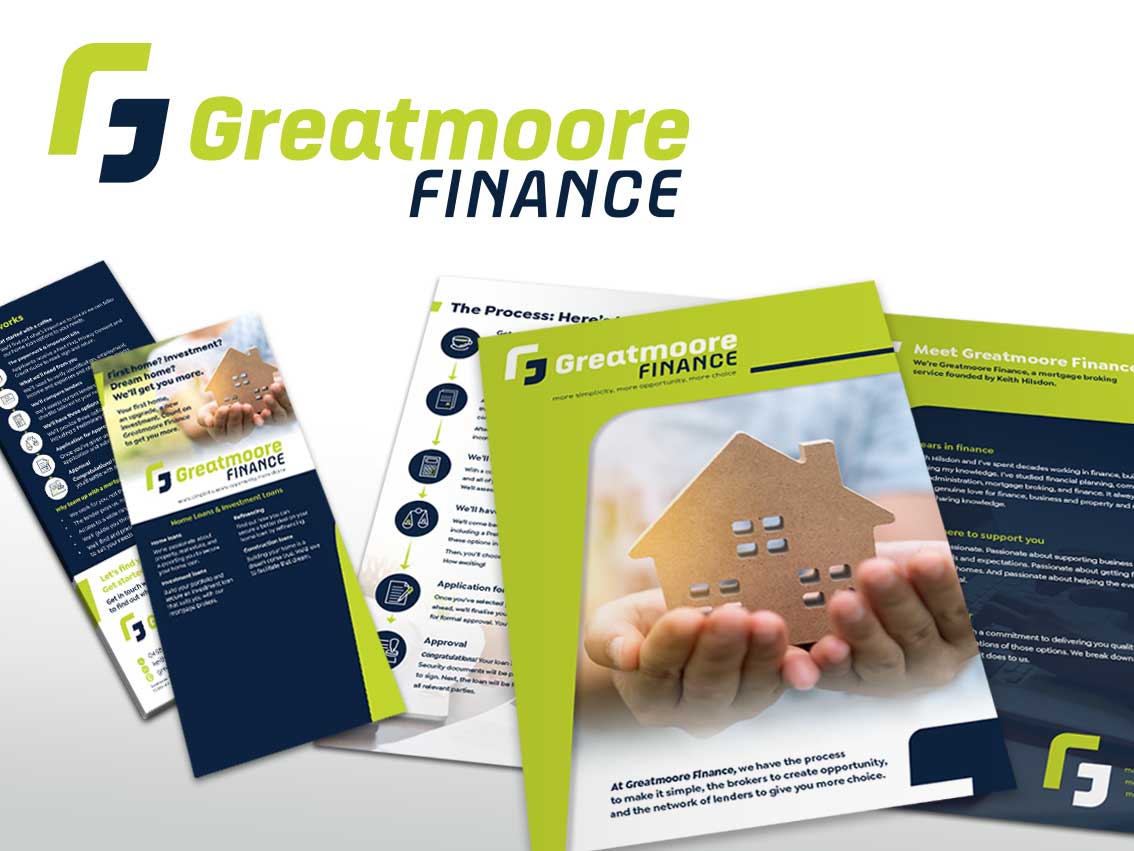
The Real-World Checklist (This Is Where Good Logos Are Made)
Let’s make this practical.
If you want a logo that actually performs, here’s what needs to be baked in from day one:
- Start with a strong, simple core
Forget the bells and whistles for a second. At its heart, your logo should be recognisable in its simplest form.
Strip it back. Remove colour. Remove effects.
If it still holds up, you’re on solid ground.
If it falls apart, it was relying on decoration, not structure.
- Design for extremes, not averages
Most logos are designed for that “perfect middle size”. That’s a trap.
Push it both ways:
- Blow it up huge. Does it still feel balanced?
- Shrink it right down. Is it still clear?
The logos that win are the ones that survive both ends of the spectrum.
- Build variations on purpose
One logo isn’t enough anymore.
You need a small system:
- A primary version
- A simplified or icon version
- A single-colour version
- A reversed version for dark backgrounds
This isn’t overkill. It’s what keeps your brand consistent when conditions change.
- Respect materials (they will humble you)
Vinyl, fabric, paint, metal, digital screens… they all behave differently.
Tiny gaps close up. Thin lines disappear. Colours shift.
So design with those limitations, not against them.
A logo that works in embroidery is usually a logo that works almost anywhere. It forces clarity. It forces strength.
- Colour needs a backup plan
That perfect on-screen colour? It won’t always show up the same in print or signage.
So your logo shouldn’t rely on colour to be understood.
Make sure it works in black and white first. Then build colour on top as a bonus, not a crutch.
- Legibility is non-negotiable
This one’s simple.
If someone can’t read your business name quickly, the logo isn’t doing its job.
No amount of cleverness fixes that.
Clear beats clever. Every time.
What Happens When You Get It Right
Here’s the upside, and it’s a big one.
When a logo is designed properly for the real world:
- Your signage looks sharp and confident
- Your brand feels consistent everywhere
- You avoid costly reworks and fixes
- Your business is easier to recognise and remember
It just… works.
No stress. No surprises. No awkward compromises down the track.
A Better Way to Think About It
A logo isn’t artwork you hang on a wall…it’s a tool.
And like any good tool, it should be reliable, adaptable, and built to handle a bit of pressure.
Still looks good? Great.
Works everywhere? Even better.
That’s the goal.
If you’ve got a logo already and you’re not quite sure how it’ll perform outside the screen, we can run a proper real-world check on it. Or if you’re starting fresh, we’ll help you build something that looks great and works hard from day one.