
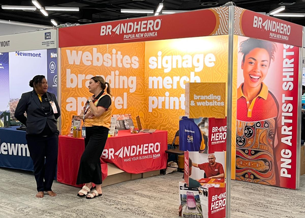
Conference signage is rarely viewed in ideal conditions.
The room is loud. People are moving. Conversations are happening everywhere at once. Attendees are scanning, not studying.
In that environment, signage has a very specific job to do. And it has to do it quickly.
You Are Competing With Everything
In a busy conference room, your signage is not competing with other signs alone.
It is competing with:
- People and movement
- Noise and conversation
- Screens, lighting, and presentations
- Attendees who are tired, distracted, or short on time
This means attention is limited and patience is low. Signage has seconds to communicate, not minutes.
Signage Must Be Understood at a Glance
The most important question conference signage needs to answer is simple.
What is this, and why should I care.
That answer needs to come through without explanation. If someone has to stop and read closely before they understand what you do, the opportunity is already slipping away.
Effective conference signage:
- Communicates one clear idea
- Uses language that is easy to grasp
- Avoids clever phrasing that needs context
Clarity beats creativity in busy rooms.

Recognition Matters More Than Detail
Conference signage is not the place for full explanations.
Its role is to spark recognition and open the door to conversation, not to close the deal on its own.
Strong signage prioritises:
- Clear brand identity
- A recognisable logo or visual cue
- Consistent use of colour and typography
Details can come later. Signage gets people to stop. People create the connection.
Design for Distance, Not the Stand
One of the most common mistakes with conference signage is designing it for how it looks up close.
Most people will see your signage from several metres away, often while walking. If it only works when you are standing in front of it, it is not doing its job.
Conference signage should:
- Be legible from a distance
- Use large, confident type
- Avoid dense blocks of text
- Rely on strong contrast
If it reads clearly from across the room, it will work everywhere else.
Support Conversations, Do Not Replace Them
Good conference signage acts like an invitation.
It gives attendees enough information to feel comfortable approaching, without overwhelming them before a conversation starts.
Useful signage:
- Sets context for what you do
- Helps staff start conversations naturally
- Reduces the need to explain basics repeatedly
When signage does its job well, your team can focus on people, not explanations.
Consistency Builds Confidence
Conference signage rarely stands alone.
It is usually part of a collection of elements including pull-up banners, backdrops, table signage, and printed materials.
When these elements feel consistent, the stand feels considered and professional. When they feel mismatched, confidence drops, even if people cannot articulate why.
Consistency helps attendees trust what they are seeing before they engage.
When Signage Works Against You
Signage struggles when it tries to do too much.
This often shows up as:
- Too many messages competing for attention
- Overly clever headlines that lack clarity
- Visual clutter that overwhelms the space
- Designs that look impressive in isolation but fail in context
In a busy room, simplicity is not a limitation. It is a strength.
Final Thought
Conference signage does not need to shout.
It needs to be clear, recognisable, and confident in a crowded, distracted environment.
When signage is designed for how people actually behave in busy rooms, it becomes a powerful support tool. It draws the right people in and makes the first interaction easier.
And in a room full of noise, that clarity is what cuts through.