Most people do not give your website a careful, generous read.
I know. That stings a bit, especially when you spent an hour getting the colour of those buttons juuust right.
They land on it, skim the top section, make a few fast judgements, then decide whether to keep going or back out. All in a handful of seconds.
They are not thinking about your sitemap. They are not admiring your dropdown menu. They are asking one quiet question:
“Is this business right for me?”
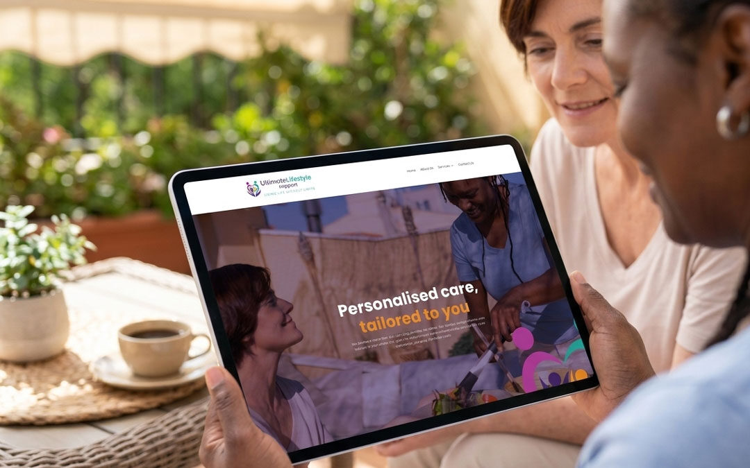
That is why your homepage has to work quickly. Especially if you are investing in website design Brisbane businesses will actually respond to. A good website is not just a digital brochure with better photos. It should help the right people understand what you do, why it matters, and what to do next.
They look for a reason to stay
When someone arrives on your website, they are usually carrying a problem with them.
Maybe they need advice. Maybe something has gone wrong. Maybe they have put the task off for months and now it is suddenly urgent. Classic.
So the first job of your website is not to sound impressive.
It is to make the visitor feel like they have landed in the right place.
Take an accountant, for example. A potential client is rarely sitting at their desk thinking, “I’d love to explore a suite of accounting solutions today.”
They are more likely thinking:
“I have no idea what my numbers are telling me.”
“My bookkeeping is messy.”
“I am worried I have missed something with payroll or super.”
That is the real conversation happening in their head.
So if the accountant’s homepage says something like:
Innovative accounting solutions for individuals and businesses
It is not terrible. It is just forgettable. You could put that line on almost any accounting website in Australia and nobody would blink.
A sharper message would sound more like:
Tax, bookkeeping and business advice made clear for Brisbane business owners who want to feel in control of their numbers.
That says more. It has a point of view. It gives the visitor a reason to keep reading.
They want plain English, not polished fog
There is a strange thing that happens when businesses write websites.
Perfectly normal people suddenly start sounding like a committee.
They say things like “bespoke service offering”, “client-centric approach” and “strategic financial outcomes”. Somewhere, a perfectly good sentence quietly gives up.
Your website does not need to sound bigger than your business. It needs to sound useful.
Visitors are scanning for answers:
- Can you help me?
- Do you work with people like me?
- Do you understand the issue?
- Are you credible?
- What happens if I get in touch?
That is why clear copy usually beats clever copy. Not always. But often.
For an accountant, this line works harder than a vague corporate headline:
We help small businesses clean up their books, stay on top of tax and make better decisions with clearer numbers.
No fireworks. No buzzwords. Just a useful promise.
And this is where good website design Brisbane businesses can rely on becomes more than colour palettes and page layouts. The design should support the message. It should guide the eye, reduce confusion and make the value obvious before the visitor has to dig for it.

They want to feel understood
People trust businesses that “get it”.
Not in a fluffy way. In a practical, “you clearly know what this feels like” way.
For an accountant, that might mean naming the problems clients are actually dealing with:
The shoebox of receipts that became a drawer.
The accounting software nobody has reconciled properly.
The BAS deadline that keeps sneaking up.
The business owner who is busy making sales but has no real picture of profit.
These little details matter.
They show you are not just selling accounting services. You understand the stress around money, compliance, tax time and business decisions. That is a different level of connection.
When a visitor sees their own situation reflected on your website, they stop feeling like they are being sold to. They start feeling helped.
That is a much better place to begin.
They look for signs you can be trusted
Once someone thinks, “Okay, this business understands me,” the next question is obvious:
“Can they actually do the job?”
This is where many websites fall a bit flat.
They make big claims, but do not give enough evidence. “Experienced.” “Reliable.” “Trusted.” Lovely words, but they need backup.
For an accountant, proof could include:
- Client reviews
- Professional memberships
- Software certifications
- Helpful guides or resources
- Before-and-after case studies
- A simple explanation of the process
Specific proof beats generic praise every time.
For example, this is stronger than saying “we provide excellent service”:
We helped a Brisbane trade business catch up on 18 months of bookkeeping, lodge overdue BAS statements and set up a monthly reporting system the owner could actually understand.
That feels real. It gives the reader something to believe.
They judge the business before they speak to you
Your website has a job before your team ever answers the phone.
The visitor is quietly noticing whether the site feels modern, organised and easy to use. They notice if the copy is messy. They notice if the page takes too long to load. They notice if the mobile version is painful. They definitely notice if the contact button is hiding like it owes someone money.
For an accountant, this matters because trust is the product. People are handing over financial information, business records, tax details and sometimes a fair bit of stress. If the website feels clunky or careless, it can create doubt before the first conversation even happens.
A polished website does not need to be flashy. In fact, for many professional services, flashy can work against you.
It needs to feel calm, clear and competent.
They need the next step to be easy
A website should not leave people wondering what to do next.
Once the visitor understands what you offer and why it matters, the next step should feel obvious.
For an accountant, that could be:
- Book a discovery call.
- Ask about bookkeeping support.
- Request a tax appointment.
- Get help with BAS.
- Enquire about business advisory.
- Download a checklist.
- Call the office.
The call-to-action does not need to scream. It just needs to be visible, specific and repeated in the right places.
“Contact us” is fine.
“Book a 15-minute call to talk through your accounting needs” is better.
It tells people what they are doing, what to expect, and why they should click.
Small wording change. Big difference.
Your website should make choosing you feel easier
A strong website does not try to say everything at once.
It gives people the right information in the right order.
First, it shows them they are in the right place. Then it explains the problem you solve. Then it proves you can help. Then it makes action simple.
That is the difference between a website that just exists and a website that earns its keep.
For Brisbane businesses, especially in competitive service industries, this matters. People have options. Plenty of them. Your website needs to help them feel confident choosing you.
That is what good website design Brisbane work should do. It should make your business easier to understand, easier to trust and easier to contact.
Start with the customer’s problem. Build the page around that. The design will have a much better job to do from there.