
You pull up beside a work ute. There’s a logo, seven services, three phone numbers, a Facebook icon and something that might be an email address.
Before you work out what the business does, the lights change.
Someone paid to put all that information there. Unfortunately, nobody had time to read it.
Vehicle signage has a different job from a brochure or website. People often see it briefly, from a distance, while paying attention to something considerably more important: driving.
The aim is to make your business easy to recognise and understand in a few seconds.
Start with what people need to know
Before choosing colours or deciding how much of the vehicle to wrap, get clear on three things:
- Who are you?
- What do you do?
- How can someone find you?
That sounds simple, but plenty of vehicle designs make the second question surprisingly difficult.
If your business is called “Edwards & Co”, your logo alone might not tell people whether you fix roofs, prepare tax returns or sell expensive candles.
A clear description such as “Electrical & Air Conditioning” helps people understand the business immediately.
You don’t need to list every service. Give people enough information to recognise when they might need you.
Give the important information room
When everything is big, bold and competing for attention, nothing stands out.
A useful starting point is to make your business name and main service the most prominent elements, followed by one clear way to contact or find you.
The exact order depends on your brand. A well-known business might lead confidently with its logo. A newer business with an unfamiliar name may need its service description to work harder.
What matters is that the eye has somewhere obvious to land.
If someone only remembers one thing from seeing your vehicle, what should it be? Design around that answer.
Use fewer words and make them readable
Your vehicle has limited space. Your audience has even less time.
“Residential, Commercial and Industrial Plumbing, Drainage, Gas Fitting, Hot Water Systems, Renovations and Emergency Maintenance” might accurately describe your business.
It is also quite a commitment for someone passing you on Gympie Road.
“Plumbing & Gas” could do the main job, with a short supporting line for a priority service if needed.
Use straightforward lettering that stays clear at a distance. Thin strokes, elaborate scripts and tightly packed text can make words harder to distinguish.
The test is whether people can read it in real conditions, not whether you can fit it on the artwork.
Make contrast do some of the work
A colour combination can look great on screen and become difficult to read on a vehicle.
Think about the difference between dark lettering on a light background and grey lettering over a busy photograph. One gives the words a clear outline. The other makes the viewer work.
Strong contrast helps your main message stand out. Keep patterns, images and decorative elements away from essential text, or give that text a clean background.
Brand colours still matter, but they need to be applied thoughtfully. If two of your colours have similar tones, they may work better as separate design elements than as text and background.
Design for the actual vehicle
A van is not a flat advertising board.
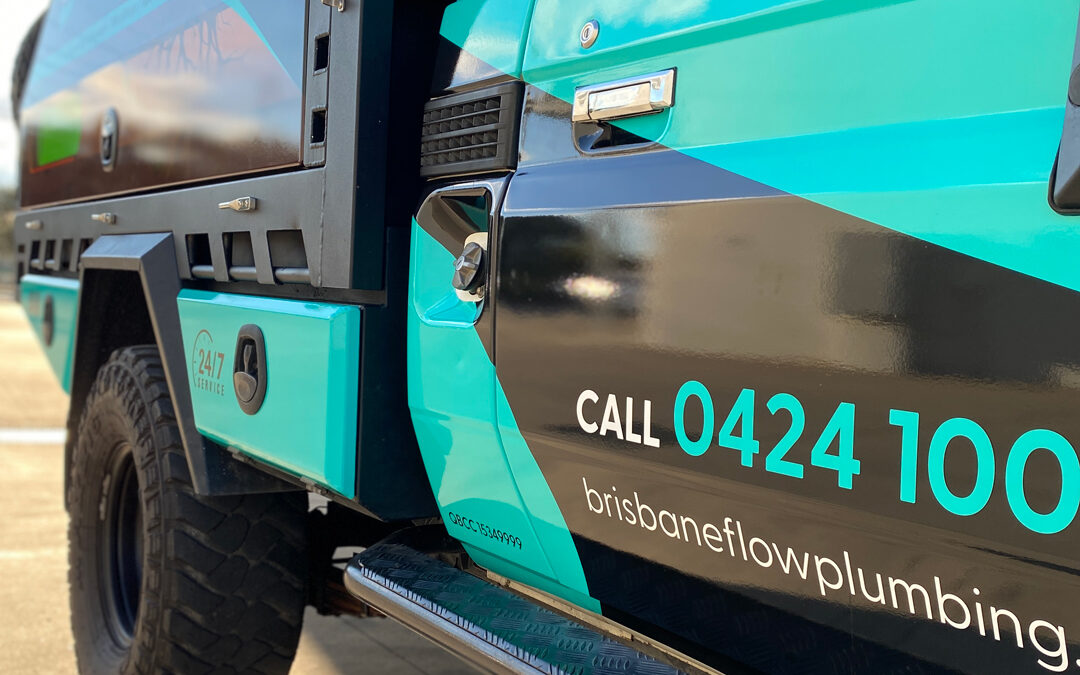
Door handles, panel joins, wheel arches, windows and sliding doors all affect where the design should sit. A phone number that looks perfect on a rectangular layout can become awkward when a handle interrupts it.
Good vehicle signage is planned around the shape and features of the vehicle.
Different surfaces also offer different opportunities. The sides provide space for a strong brand impression. The rear may allow someone parked behind you to take in a little more detail.
That doesn’t mean filling the rear doors with everything you left off the sides. A traffic queue is still not a captive reading group.
Choose a clear next step
You don’t automatically need a phone number, website, email address and every social media account on your vehicle.
Choose the contact method that suits how your customers buy.
For a service business, a clear phone number may be useful. A short, memorable website address can help people find out more later.
QR codes need more thought. They may have a role on a vehicle regularly parked at events or job sites where pedestrians can approach safely. They’re a poor choice as the main response method for moving traffic.
Make the next step easy to remember and act on when it’s safe.
Check the design beyond your computer screen
Before approving the artwork, look at it on a realistic vehicle mock-up, then view it smaller and from a distance.
Ask someone who hasn’t been involved in the design to glance at it briefly.
Can they tell you the business name? Do they know what you do? What do they remember?
If they have to study it, simplify it.
There’s no universal font size that guarantees readability at 60km/h. Distance, lighting, viewing angle and movement all affect what people can see. A sensible design gives the essential information the best chance of being noticed.
Make your vehicle look like it belongs to your business
Vehicle signage should feel connected to your website, uniforms, business cards and other branding.
When someone sees your van outside a job, then looks you up later, that consistency helps them recognise they’ve found the right business.
You don’t have to cover every panel to make an impression. Well-designed partial wraps and simple signage can be highly effective when the message, placement and contrast are right.
Need vehicle signage people can actually read?
Brand Hero designs and installs vehicle signage and wraps for Brisbane businesses. From a single ute to a fleet of vans, we’ll help you look professional and make your message clear on the road.