
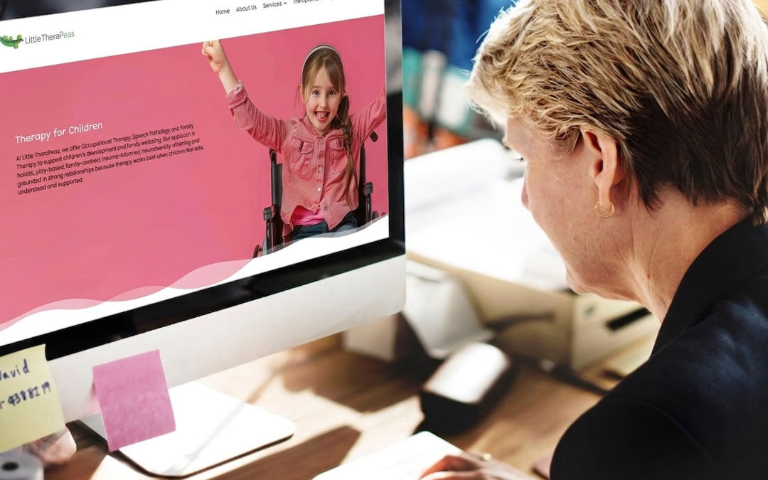
A lot of community services websites are built with good intentions.
They list the services. They include some photos. They have a contact page. And technically, yes, they are “online”.
But that does not always mean they are doing their job.
For community services organisations, a website is not just a digital brochure. It is often the first point of contact for people who are looking for help, support, reassurance or answers. That might be a family member researching aged care options. A participant trying to understand NDIS supports. A carer feeling overwhelmed. A referrer looking for a trusted provider. Or a potential staff member deciding whether your organisation feels credible and professional.
A good website should make things easier, not harder.
It should help people quickly understand who you are, what you do, who you help and what they should do next.
So what should a good community services website actually include?
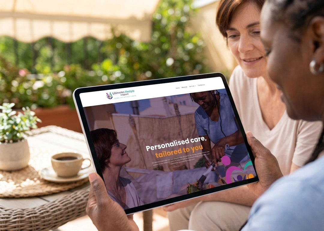
1. A clear explanation of who you help
This sounds obvious, but it is one of the most common things websites get wrong.
Too many organisations lead with internal language, vague mission statements or broad descriptions that do not immediately tell the visitor whether they are in the right place.
Your homepage should quickly answer questions like:
- Who is this organisation for?
- What kind of support do they provide?
- Where do they provide it?
- How do I know if this is relevant to me?
People should not have to dig through multiple pages just to work out whether you can help them.
Clear messaging matters because many website visitors are already under pressure. They may be stressed, tired, confused or comparing several providers at once. The faster you can remove uncertainty, the better.
2. A simple, logical structure
A good community services website should feel easy to move through.
That means the structure needs to make sense to someone outside your organisation, not just to your internal team.
In most cases, the website should include:
- a clear homepage
- an about page
- service pages
- a contact page
- location information if relevant
- referral or intake information
- careers or recruitment pages
- key trust and compliance information
The navigation should be straightforward and predictable. Service pages should be grouped in a way that makes sense to the people using the site. Headings should be clear. Menus should not be overloaded.
If someone lands on your website and feels lost, the structure is not doing its job.
3. Dedicated service pages
One of the biggest missed opportunities on community services websites is cramming too much into one generic “services” page.
If you offer multiple services, each one should usually have its own page.
That gives you space to explain:
- what the service is
- who it is for
- what support looks like
- how the process works
- what the next step is
It also helps with search visibility and makes the site more useful for referrers, families and stakeholders who are looking for something specific.
Most importantly, it reduces confusion.
Clear service pages help people feel more confident about reaching out because they can picture what support actually looks like.
4. Trust signals throughout the site
Trust matters in every industry, but it matters even more in community services.
People are not just comparing prices or products. They are deciding who to trust with care, wellbeing, support and important life decisions.
A good website should include trust signals that help visitors feel reassured.
That might include:
- staff photos and team introductions
- testimonials
- accreditations or registrations
- quality standards
- years of experience
- clear contact details
- partner organisations
- case studies or stories
- real images of your team, environment or service delivery
Trust signals should not feel boastful. They should simply help people feel that your organisation is real, credible and professional.
Even small details matter. A polished, consistent website design can say a lot about how organised and reliable your organisation feels.
5. Accessibility that is taken seriously
Accessibility should not be treated as an optional extra.
Community services organisations often support people with disability, older people, carers, culturally diverse communities and people navigating stressful situations. Your website should be designed with readability and accessibility in mind from the start.
That includes things like:
- clear headings
- plain English
- readable font sizes
- strong colour contrast
- mobile-friendly layouts
- descriptive button text
- forms that are easy to complete
- simple page layouts
- minimal clutter
It also means thinking carefully about the language you use.
A website can be visually attractive and still be hard to use. If the wording is too complex, the pages are crowded or the next step is unclear, the site is not accessible in a practical sense.
Good accessibility improves the experience for everyone.
6. Calls to action that are clear and supportive
A surprising number of websites explain the organisation reasonably well but then leave the visitor wondering what to do next.
Every important page should include a clear call to action.
That could be:
- Book a chat
- Make an enquiry
- Refer someone
- Speak with our team
- Request a callback
- Find your nearest location
The key is clarity.
Your calls to action should match the mindset of the person visiting the page. In community services, people often need supportive guidance rather than aggressive sales language.
A good call to action helps people take the next step with confidence.
7. Contact information that is easy to find
If someone is ready to get in touch, do not make them hunt for your details.
A good website should make contact options visible and simple. That may include:
- phone number
- email address
- contact form
- physical address
- opening hours
- map or service area
- referral instructions
- emergency or urgent support guidance if relevant
This is especially important for people who may already feel overwhelmed. The fewer barriers you create, the better.
8. Recruitment content that reflects your organisation well
For many community services providers, the website is not only there for clients and referrers. It is also an important recruitment tool.
Potential staff are paying attention to how your organisation presents itself.
A good website should help people understand:
- what your organisation stands for
- what kind of team environment you offer
- the roles you are hiring for
- why someone would want to work with you
A clear, professional website can strengthen first impressions and help attract the right people.
9. Consistent branding across every page
A website should feel like part of a bigger whole.
Your colours, fonts, photography style, messaging and overall presentation should feel consistent from page to page. That consistency builds confidence. It helps your organisation look organised, trustworthy and established.
Branding is not about making things look fancy for the sake of it.
It is about helping people recognise you, understand you and trust you.
When your website feels inconsistent, outdated or unclear, it can create doubt, even if your services are excellent.
10. A website built for real people, not internal assumptions
This may be the most important point of all.
A good community services website is built around the needs of the people using it.
Not internal department structures.
Not organisation chart language.
Not assumptions about what people already know.
The best websites step into the shoes of the visitor and ask:
- What are they likely worried about?
- What are they trying to understand?
- What information would help them feel more confident?
- What is the clearest next step?
That is where good website strategy starts.
In the end, clarity matters more than cleverness
A good community services website does not need to be flashy.
It needs to be clear.
It needs to be easy to use.
It needs to build trust.
And it needs to help people take the next step.
When a website is structured well, written clearly and designed with accessibility in mind, it does more than improve your online presence. It helps your organisation communicate better, look more professional and support people more effectively.
That is what good branding and website design should do.
Need a clearer website?
If your website feels outdated, confusing or does not reflect the quality of your organisation, Brand Hero can help.
We design websites and brand assets that help community services organisations build trust, improve clarity and present themselves professionally.
Book a chat and let’s make your website clearer.
Brand Hero positions itself around practical, plainspoken communication, professional presentation, and consistency across websites, signage, print, and brand touch points, which fits this trust-first approach for community services organisations.