Last month we did a post on brand consistency. We discussed the importance of maintaining a consistent visual image across all places your logo is seen – from your website, to your vehicles and business cards.
Getting your brand colours correct is a critical element of brand consistency.
At times this can be tricky, especially if they are not set up correctly in the first instance. And with different print technologies producing different colour results, having your brand colours properly identified, recorded and adhered to is critical.
A Question of Colour
Let’s have a look at the four main colour modes we use to produce your work:
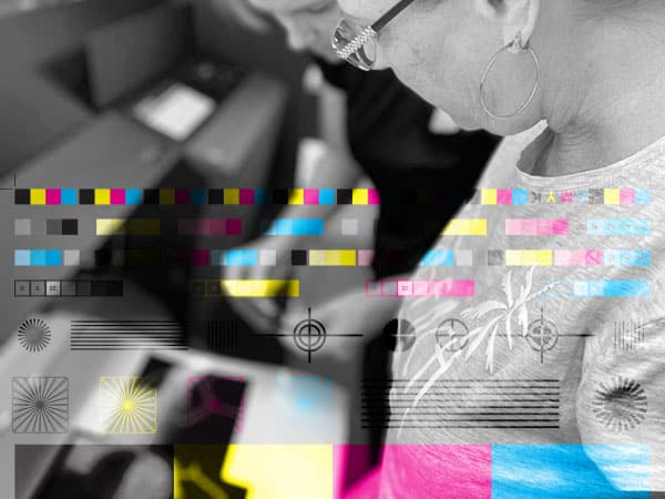
CMYK Colour Mode: Also known as Full Colour or CMYK, this is the most common “print” colour mode. Where you are getting business cards or building signs, chances are we are using a combination of Cyan, Magenta, Yellow & Black to produce your work. Similar to your home printer, small dots of these colours are overlaid on top of one another to create a “full colour” effect.

Pantone Colour Mode: For true printing accuracy, using the Pantone Matching System (PMS Colours) is ideal. Unlike CMYK that using 4 colours overlayed to create the colour, Pantone has a specific colour code for each colour. This way, it doesn’t matter where your work gets printed, we can match it to a universal code. Mostly used by large corporations. Think Coca Cola red.

RGB Colour Mode: When you move off the paper or vinyl and into the world of screens (computers, phones) CMYK then becomes RGB. This is when a combination of red, green, and blue light are added together to reproduce various colours. RGB colour is often much more vibrant.

Hex Colours: Similar to RGB, Hex Colour Codes are 6 digit combinations of numbers and letters to create a specific colour tone. This is often used in website design.

Other Colours: If your brand colours contain metallic or fluorescent colours, you will need to be prepared to accept the fact that sometimes colours are impossible to produce in standard print and display methods and can often lead to great expense in producing them. Our advice is to avoid these where possible to maintain the integrity of your visual brand across all applications.

Best First Step
Getting your colours right from day one of your logo design is really the best step you can take to getting them right down the line, no matter what the print or display media. Get your designer to choose colours from the PMS system, then convert them to CMYK or RGB down the line if needs be. This way, you are always matching a specific colour code and standard used across the world.
It’s Never Too Late
If you aren’t sure what the colour codes are for your logo, ask your designer. They should be able to to send you the colour codes and keep them on file for when you need them. Alternatively, click below or email us and we can colour match your logo to the correct codes free of charge.