
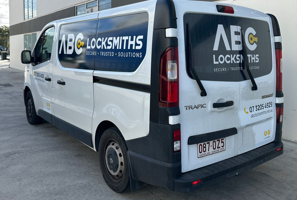
Vehicle signage has one job above all else.
Get noticed, get understood and help people remember who you are.
That sounds simple enough, but it is amazing how many vehicle wraps and graphics try to do everything at once.
Logo.
Phone number.
Website.
Email.
ABN.
Facebook.
Instagram.
Ten services.
A slogan.
A photo.
Another logo.
Then someone decides there is still a bit of empty space on the back door, so in goes a QR code.
Before long, the vehicle looks less like a moving billboard and more like a takeaway menu.
People only have a few seconds
The biggest problem with cluttered vehicle signage is that people rarely get much time to read it.
Your van might be driving past at 60 km/h.
It might be sitting three cars ahead at a set of lights.
Someone might only glimpse it as you pull into a driveway.
That means your signage needs to communicate quickly.
If a person has to work out where to look first, you have already lost valuable attention.
Good vehicle signage creates a clear hierarchy.
Usually that means:
- Who are you?
- What do you do?
- How can I find you?
That is often enough.
More information does not mean more effective
Business owners naturally want to get maximum value out of the space they have paid for.
We understand the thinking.
“If we are wrapping the whole van, shouldn’t we put everything on it?”
Not necessarily.
The value of vehicle signage is not measured by how many words you can squeeze onto the panels. It is measured by whether people notice and remember the business.
If your vehicle lists plumbing, drainage, gas fitting, hot water systems, leak detection, blocked drains, renovations, maintenance and emergency repairs in tiny writing, there is a good chance nobody is reading any of it.
A large, simple message saying:
PLUMBING + DRAINAGE
might do a much better job.
Give the logo some room to breathe
Your logo should be one of the most recognisable elements on the vehicle.
But logos lose impact when they are surrounded by too much information.
If there are text boxes, phone numbers, icons and images competing for attention on every side, the brand can disappear into the noise.
White space, or simply uncluttered space, is not wasted space.
It gives important elements room to stand out.
Sometimes the best thing we can do to improve a vehicle design is remove something.
Then remove something else.
Decide what you actually want people to remember
This is a useful question to ask before designing any vehicle signage.
If someone sees your ute for three seconds, what is the one thing you want them to remember?
For most businesses, it is probably the business name and the main service.
Not the email address.
Not all seven social media accounts.
And probably not the entire history of the company.
Think about the person who sees your vehicle today but does not need your service until three months from now.
You want them to remember:
“Those Brand Hero people do vehicle wraps.”
Or:
“That was the electrician with the orange vans.”
Recognition matters.
Your vehicle is not your website
This is another common mistake.
A website has the luxury of time. People can scroll, click, read services, look at projects and learn more about the business.
A vehicle does not.
Vehicle signage should create recognition and interest. Your website can do the explaining.
That is why a clear web address can sometimes be more useful than trying to fit every service onto the vehicle itself.
The vehicle gets their attention.
The website gives them the details.
Design for distance
Something that looks perfectly readable on a computer screen may be useless from ten metres away.
This is why vehicle signage should always be considered at real-world scale.
Text needs to be large enough.
Contrast needs to be strong enough.
Important information needs to be positioned where it will actually be visible.
Vehicle shapes matter too.
Door handles, wheel arches, windows, body lines and panel gaps can all interfere with the design.
A good layout works with the vehicle rather than simply treating it as a flat rectangle.
Think about the back of the vehicle
The rear of a van or ute is often some of the best advertising space you have.
Why?
Because people can sit behind you at traffic lights for a minute or two.
This gives you slightly more time to communicate, but that still does not mean filling every centimetre.
Keep the key information strong and easy to read.
Business name.
What you do.
Website or phone number.
Done.
If someone can understand the business without squinting, you are on the right track.
Simple does not mean boring
There can be a temptation to think that removing information will make a vehicle look plain.
The opposite is often true.
Bold colours, good typography, strong imagery and clever use of the vehicle shape can create far more impact than simply filling every available space.
Some of the most memorable vehicles on the road are incredibly simple.
That simplicity is often what makes them memorable.
The three-second test
Here is a useful way to judge your vehicle signage.
Stand back from the design and look at it for three seconds.
Then look away.
What do you remember?
The business name?
The main service?
A distinctive colour or graphic?
Good.
If all you remember is that there was “a lot going on”, the design probably needs another edit.
Your vehicle should make the business easier to remember
Vehicle signage is one of the few forms of advertising you can own and use every day.
A well-branded vehicle can build familiarity around your local area, make your team look more established and turn every trip into another brand impression.
But that only works if people can actually understand what they are looking at.
So resist the urge to fill every gap.
Choose the message that matters.
Make it big.
Make it clear.
And give it enough room to do its job.
Because when it comes to vehicle signage, less information can often create a much bigger impression.
Need a fresh set of eyes on your vehicle signage?
At Brand Hero, we design, produce and install vehicle graphics and wraps that help businesses get noticed without turning their vehicles into rolling noticeboards.
If you are planning a new vehicle or wondering whether your existing signage is trying to say too much, we can help simplify it.