Griffin Medical Centre: Complete brand identity for local clinic
When Kris Gunawardana and his wife were looking to open a medical centre on Brisbane’s northside, the ever-growing suburb of Griffin was the ideal location. Situated adjacent to Murrumba Downs, the region has rapidly developed with the addition of retail and food outlets, with a medical centre sorely lacking.
Kris came to us last year, armed with only a business name and some rough ideas. This is how we like it, a blank canvas to add colour, images and create an identity.
The Logo
Like always, we started with the Griffin Medical Centre (GMC) logo design. Kris wanted a modern look with a clean and simple design. Using the colours orange and cool green, he wanted to incorporate the fact it was a family-run clinic, for families. This was a central theme for us and the logo had to reflect the family orientated ethos of the clinic.
Creating the image of the ‘family tree’ was a great idea from our graphic designer Erin, it worked perfectly for a medical centre. This symbolises growth, health and family, all in one simple graphic. In addition to this, the graphic works well across a variety of media – from signs, to business cards, to the company’s online presence.
The Signs
After the logo was signed off, we moved onto the other items required by GMC. Some temporary banner signs were quickly done up to let passersby know of the new medical centre’s pending arrival, whilst we got to work on the more permanent building and reception signage.
The building itself consisted of 2 large 4.8×1.2m aluminium signs, coupled with a brilliant 3D lettering sign for the front fence. Constructed from 10mm perspex, this really helps GMC stand out, creating a high impact from the roadside. Windows were dressed with brilliant full colour imagery, creating a wonderful impression as visitors entered the building.
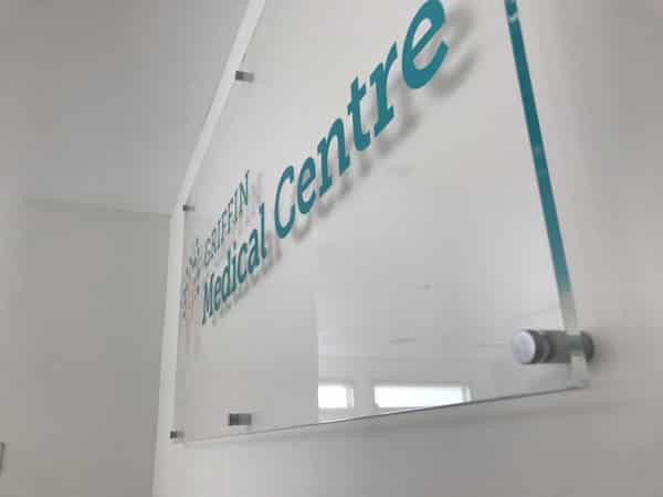
In addition to this, a clear perspex reception sign was also added behind the main reception counter. Offset from the wall with panel mounts, this was a great professional-looking addition to the waiting room and reception area.
The Printing
Brand Hero’s work with GMC was not limited to signage. We were also commissioned to print their stationery for both business and promotional purposes. Appointment cards were printed in full colour with rounded corners and a matt celloglaze coating. Glossy fridge magnets and large run flyers were also printed and distributed to the local area. All items have been created with the original logo in mind to maintain a sense of unity with the new branding.
The Verdict
Further vehicle branding, as well as internal and directional signage is in the works for GMC. Brand Hero was proud to assist Kris and his team with this project and are so happy with the end result, as is the customer. From a blank canvas to a well-branded medical centre that reflects the family-centred values of the business owners. All parties are happy with the results!
From the Customer
“You were instrumental in this journey, my wife and I appreciate all your help”
Kris Gunawardana
Description of Works
Printing:
- Business Cards
- Letterheads
- Envelopes
- Flyers
- Posters
- Fridge Magnets
Signage:
- Building Signage
- One Way Vision Graphics
- Frosted Door Graphic
- Acrylic 3D Lettering
- Acrylic Reception Sign
Design:
- Logo Design
Your Medical Brand Specialists


